
Develop Baseline Measures And Make Them Visual
Before we try to make improvements in any organization, it is important that we understand the current conditions within that organization and establish a baseline measure. This measure must then be visually communicated to everyone in the organization.


Before we try to make improvements in any organization, it is important that we understand the current conditions within that organization and establish a baseline measure. This measure must then be visually communicated to everyone in the organization.
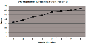
We can use a 100-point rating system to evaluate the current organization level. At regular intervals, we need to reevaluate the level of organization, comparing it to our original rating, and post the results. Graphically depicting these time-based ratings will allow everyone to see the progress being made and reinforce the importance of the organizational effort. The following line graph shows the ratings associated with a workplace organization effort over an 8 week period. In this case, an upward trend is good.
In addition to a graph of the workplace organization rating, it is helpful to focus attention on problems being uncovered. A bar graph plotting such problems and their frequency of occurrence is useful for this kind of data.
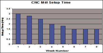
When trying to improve machine setup time, we need to measure how long setups currently take. Documenting current practices and times for specific tasks can provide insight into opportunities for improvement. As quick change-over principles are adopted and setup times are reduced, visual measurements will show progress and help to ensure that improvements take hold. The following bar graph shows setup times for a CNC mill over an eight-week period. In this case, a downward trend is good.
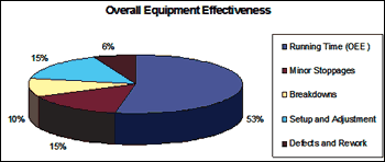
When trying to reduce equipment downtime, we need to measure current performance and identify the major causes of downtime. Measuring the run time, along with times attributed to minor stoppages or idling, setups, breakdowns, running slower than standard speeds, and time spent making defective parts, will help to prioritize needed actions. A pie chart is highly effective in communicating this information.
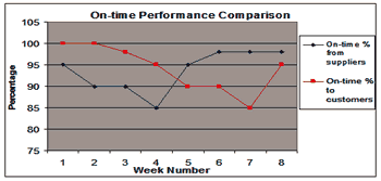
Graphically comparing multiple measures can also provide valuable insights. For example, the relationship between on-time delivery rates from suppliers and on-time shipment rates to customers is worth evaluating. This comparison might reveal a direct relationship (as one goes up, so does the other), an inverse relationship (as one goes up, the other goes down), or some other relationship not previously considered. What would you say the following graph expresses regarding the relationship between on-time deliveries from suppliers and on-time shipments to customers?
No matter what baseline measures you capture, communicating the results visually will go a long way in making your improvement effort a success.


