
Tell a Story
Communicate success in your operations using visuals and you just might inspire further improvements.

Share


We learn things when we hear a story. Likewise, companies that have made meaningful improvements in their operations can effectively communicate these improvements to employees, customers, suppliers and other stakeholders by telling a story. Of course, the best stories are the ones told using visuals, because they help the listener retain the message. So what are some good ways to tell a story using visuals? I have found the following techniques helpful in my own storytelling of late.
Most of us at some point have taken photos of “before” and “after” conditions. Though certainly a powerful tool for communicating change, sometimes filling in the gaps as to what happened between the before and the after also can be helpful, especially if you expect to repeat a process that led to success. For example, in recent 5S events, I have dutifully taken before photos, but have also captured activities during the event, such “sorting” unneeded items, “setting in order” items that are needed, and “shining” the area to make it look clean and safe. Further, I have taken photos that show efforts to “standardize” organization in the work area, such as color codes, well-marked storage areas and floor location indicators. Finally, I have captured ideas, such as audit forms/schedules, checklists and scorecards to help “sustain” workplace organization at the conclusion of the 5S event. All of these photos combine to tell a complete story of the 5S event, a story that can provide guidance for another event in the future. Some companies have used these photos in slideshows that are prominently displayed to tell their “workplace organization improvement” story to everyone (another way to “sustain” the gains achieved).
Videos can also tell an impressive story, whether they are of short duration, meant to capture a simple improvement (such as a new fixture to simplify mounting a part in a machine), or in a time-lapse format ideal for showing improvements that occurred over a longer timeframe (such as a change in a facility’s layout). With continuing advances in technology, many of today’s mobile phones have time-lapse-video capability that allows you to mount the device, turn it on and go. Just like photo slideshows, both short-duration and time-lapse videos can be put on display throughout a company as a means of sharing a good story (and making more people aware of things that are going on within the company).
One of the great “accidental” inventions of our time, the sticky note (like the Post-it brand) can also help tell a story. During a process improvement event, original process steps can be shown in one sticky note color, while one of another color can be used to represent the steps in a new process. Most likely, the new process will contain fewer sticky notes and convey better outcomes (a happy ending to the story). Sticky notes are especially useful when telling stories about improvements in administrative processes, such as order entry, purchasing, quoting and “customer care” activities.
Charts and graphs, if kept simple and made clearly visible, can also tell a compelling story. Many companies use charts shaped like letters to manage key metrics, for example, an S-shaped chart for safety or a Q for quality. Each chart might contain days of the month within the outline of the letter, as in the quality chart shown here:
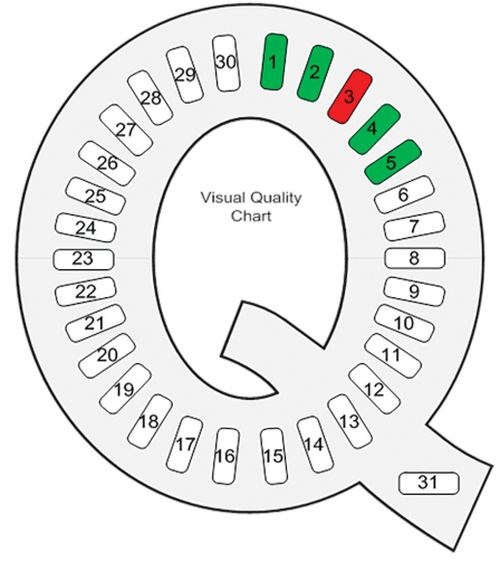
Such charts are used to record how a department or workcenter performed each day on that key metric, once an acceptable requirement is established and communicated. On a day when the metric’s requirement is met, the number corresponding to that date of the month is shaded green. Days when the metric’s requirement is not met are shaded red. The letter-shaped chart clearly tells a story, both for specific dates in the month and the month as a whole (the greener, the better). In a prior column (“The Visual Factory,” April 2014), I discussed using a similar chart with a 5S-shape as a simple means of evaluating the condition of a work area at the end of a shift. That chart also could tell a story about the effectiveness of workplace organization during any given month.
Create your own stories as you make improvements in your organization. Success breeds further success. Employees who hear about success in other areas will often try to duplicate or even improve upon that success in their areas. Besides, who doesn’t like to tell a good story?


.png;maxWidth=300;quality=90;format=webp)


